Why White Should be in Your Home!
DISCLAIMER: If you consider yourself a person who wouldn’t paint your walls white because it’s boring or sterile PLEASE READ THIS! I promise you, painting your walls all gray because you think it will help modernize or make your space feel bigger is an oversight. Using white on some walls in your home will instantly make it feel larger, brighter, and clean. Plus, it will make decorating the space that much easier. I’m not saying that every wall in your home needs to be white (man oh man, there are so many beautiful colors to pick out there so please use them), I’m just wanting you to consider adding white into some areas that you want to give a facelift to. Don’t be afraid of it and maybe drop the gray paint moving forward.
Side note: Our house will NOT BE ALL WHITE, I have colors picked out for the rooms. Some ceilings won’t even be white!!! *insert shocked face*

For the record, WHITE IS NOT JUST WHITE!
(*cough cough* I’m speaking to you random guy working at the Brookfield Sherwin Williams haha). White is very complex and should be understood before painting with it. It might seem like the easiest decision to make, you just decide “yup, that wall will be white!”. Then you head into your local paint store and realize… ”Damn, there are so many whites to pick from!”. So you probably pick the white that’s labeled “true white” or whichever one seems super white because you don’t want to waste time and want to make sure it doesn’t look yellow. However, what you’re actually doing is making an uneducated guess. This random white that you just grabbed could make your entire room feel off. So let me explain how you should approach picking a white from now on, because TRUST ME, you want to use white!
Let’s start off by understanding why white isn’t just white. White is the most reflective color out there. It may seem like a neutral, but it actually reflects whatever it’s surrounded by or mixed with. I’m sure you’re familiar with people saying “this white has warm undertones” or “this white feels cool”. What people mean by this is that the white isn’t neutral, it wasn't created with a warm color like yellow or mixed with a cool color like blue.

The large buzz words you’ll usually hear when looking at different colors are hues, tints, tones, and shades. These words are often used interchangeably but they are very different. Hue is what color family it comes from, so hue would be those primary, secondary, and tertiary colors I had talked about in my What Design School Taught Me, Part 1 post (the colors in the photo). Tint would be that pure color or hue we just talked about but mixed with white, think pastels here (red + white = pink). Tone is when true gray (equal parts black + white) are mixed into the color. If you mix too much gray into the color it will remove the bright nature of it and create a muddy tone (blue + gray = soft muddy blue tone). Lastly, shade is when you have a true color and mix black into it (opposite of tint). Your color will remain the same color, but it will get darker with more black added (red + black = maroon shade).
Image found on the Beach Painting Contractors website.
Now that we have that covered, let’s look at how hue, tint, tone, and shade play into your white decision. Since white and black are technically additives to primary, secondary, or tertiary colors the term “hue” essentially doesn’t apply to it as much. The tint and shade come in when you’re adding white to black or black to white which would make gray. Otherwise, tint would be the color white with white added and that doesn’t get you anywhere. But tone is very important! Reminder, tone is created when adding in gray. If someone says that a white has a gray tone to it that’s why. What’s more important here are the undertones that white can hold. So not only could white lean gray it could also have any hues in it which make up the undertones. For instance, when talking about tint and the color yellow you would have yellow + white = a cream pastel color. So if you add in a lot of the white tint the yellow disappears more and the white takes over. Making it a hue that lands in the white family and no longer yellow. This color would then be described as a warm white since it has a yellow hue to it.

Let’s circle back to the point I made earlier about white being the most reflective color. Since you now have an understanding of the basic terms used to describe colors you can move forward looking at what your space currently has in it and how much natural light you get. These are the two largest components to choosing the best white for your walls.
I’ll be using our new home as an example here. Our house faces North and South with 2 East-facing small windows and 0 West-facing windows. North and South-facing windows provide a steady amount of light throughout the day, but never any direct sun. Since there isn’t direct light streaming through the windows it usually casts a light shadow which ultimately creates a gray tone to the rooms. Whereas, if you had a large East-facing window, you’d have warm light streaming through in the mornings with the sun.
Below are the swatches I set out for our cabinet color. I wanted to see them in one location throughout the day to see if some colors felt different. DID THEY EVER! The picture on the left was taken at 7 am by our South-Facing window. The picture on the right was taken at 7 pm (with no overhead lights on). This is why it’s so crucial to see the swatches or paint samples in the location they will be living.


I then took a look at the items I’d be placing inside these rooms like decor and furniture. For the most part, I have a very warm color palette with my decor. I use a lot of burnt oranges, creams, browns, and natural textures like wood, woven baskets, and black metals. Given that I don’t have that warm direct light and I decorate with warm hues I knew I wouldn’t want to pick a super cool-tinted white.
If I would paint a cool white on the walls the gray shadow created with the indirect sun would be enhanced and make the room feel even muddier and gray instead of bright white.
The cool white would clash with the warm hues I decorate with.
You can see the warmth in my decorating style with the two pictures below. Even though I have green and blue in my home, I pair them with a lot of warm hues to make them fit.


At this moment you’re probably thinking “great, go with a warm white then!”. But the problem with picking a white that would lean too warm would be that it would fall yellow then. There wouldn’t be enough natural light in the space to brighten it up and my warm-hued decor would reflect on it, ultimately enhancing the yellow even more. Which lead me to figure out what the best white paints out there would be for my space. I wanted to either find the perfect neutral white that didn’t lean particularly in any direction or I wanted to find a white that had subtle warm undertones. The one thing I knew for sure was that I didn’t want a cool white.

My top 3 contenders for our walls in the house were Simply White by Benjamin Moore, Chantilly Lace by Benjamin Moore, or Pure White by Sherwin Williams. I hung the swatches up and realized that wasn’t enough. So I went and got sample sizes of the paints, which is when I found out that Sherwin Williams had stopped offering sample sizes right now. Which immediately threw Pure White out the door because I wasn’t about to pick a white I couldn’t sample on my wall.
Through many hours of research and hundreds of color swatches later, I finally found a nice array of whites that I think everyone should consider using in their homes. Just remember when picking one of these whites you should first recognize what your natural light and decor situations are. This will help you determine that white decision. I also suggest buying the sample sizes of the paint once you narrow it down to a couple. Painting on samples makes such a difference from just hanging up that 2-inch long paper swatch. By painting a chunk of it on the actual wall it will live on you’ll be able to see how it changes throughout the day given the light.
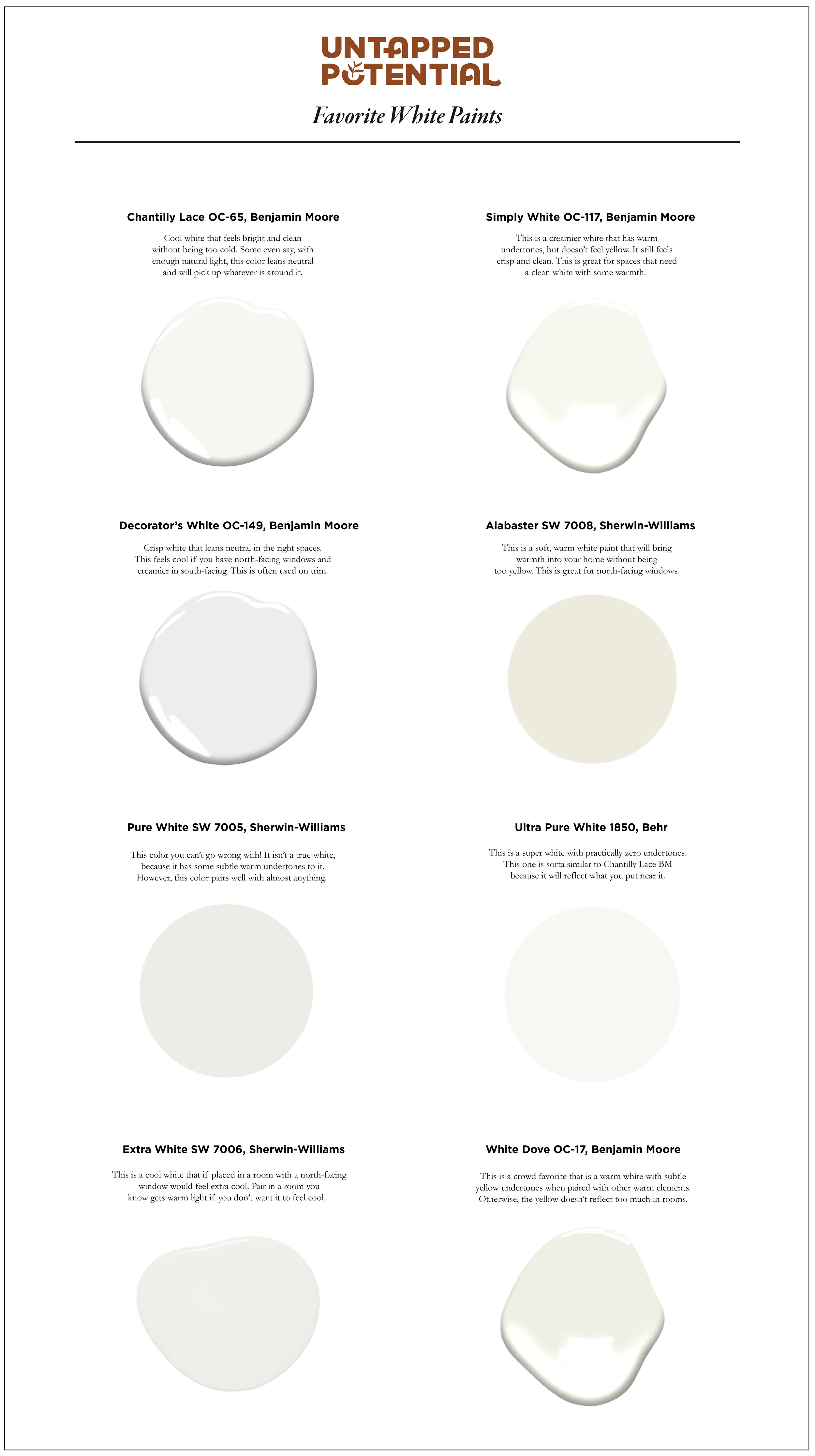

I decided to go with Simply White by Benjamin Moore for our house. This white worked perfect in both our North and South-facing windows. I also tested the color in our East-facing room too and it worked wonderfully. I found it to be bright and crisp but had the perfect amount of warmth to it so it didn’t feel sterile and gray. I would highly recommend using this color if you’re looking to brighten your space but still have it feel like a welcoming white. The quality of Benjamin Moore paint has been great as well. It applies to our walls in thick coats and spreads evenly. So far I have been very pleased with our purchase and all the help the store I got it from has provided.
I can’t wait to share with ya’ll what the other room’s colors will be, because yes, there will be rooms that have some bold color choices aside from the tedious decision of white!

I hope this blog post has been insightful and also helpful when considering painting walls in your home white. I think once you do it and see the difference you’ll want to do it more! It really makes everything else you accent your home with pop. Let me know in the comments if you enjoyed this post and if you learned anything or have any white recommendations I may have missed.
HAPPY PAINTING!!!