What Design School Taught Me, Part 2
FOCUS: PERSPECTIVE / BALANCE
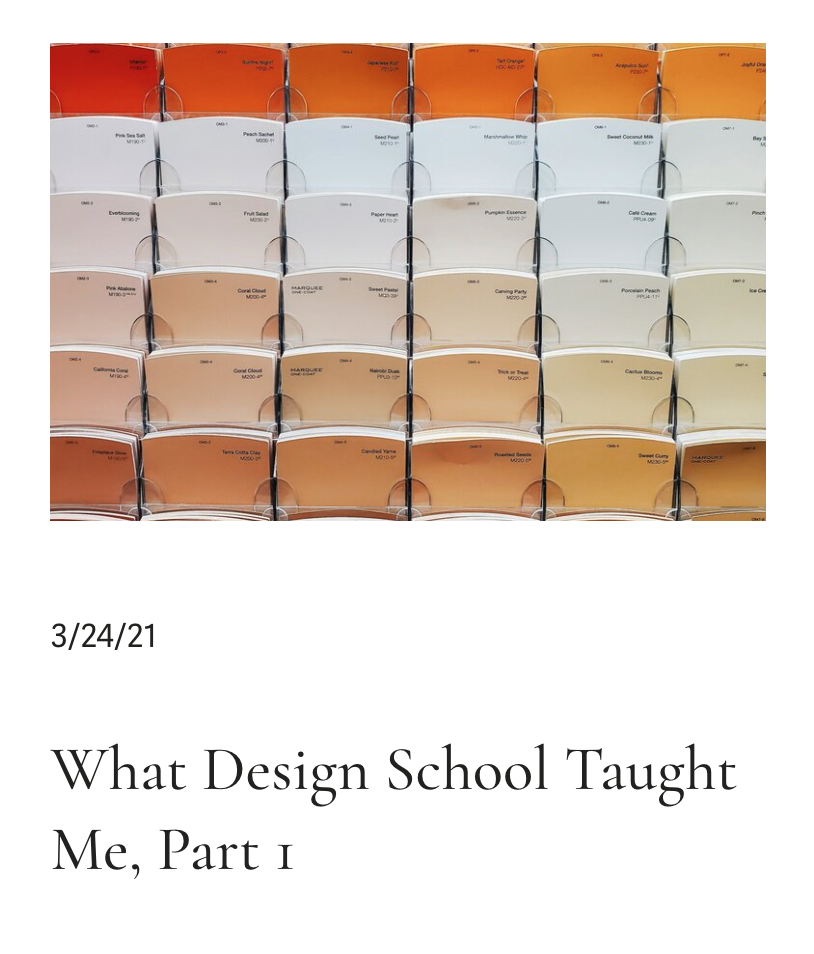
Let’s continue the conversation we started last week about what going to Design school taught me and how I apply it to my life every day. Last week I covered all things color theory, if you didn’t read about that I’d suggest you head over to last week’s blog post to get an idea. This week I’ll be covering perspective and balance, which I believe are runner-ups to color theory on the importance scale.
Perspective definition according to Oxford Languages: the art of drawing solid objects on a two-dimensional surface so as to give the right impression of their height, width, depth, and position in relation to each other when viewed from a particular point.
A Balance definition according to Merriam Webster: an aesthetically pleasing integration of elements
I first want to circle back to a few questions I asked you last week, mainly the ones that had to do with perspective and balance.
Have you ever looked at a shelf you decorated and wondered if it looked balanced or aesthetically pleasing? Or have you ever ventured onto Instagram or Pinterest and found inspiration but didn’t understand why when you tried to recreate it, it didn’t work?

I posted these questions to my Instagram story as a poll and I thought the results were worth sharing. When asked if a shelf you decorated felt aesthetically pleasing and balanced, 84% of you said “you question yourself” on knowing if it looks good. When asked if you’ve ever felt disappointed that your recreation of a Pinterest photo didn’t work 93% of you said “too many times”. Those are some pretty high numbers of people who feel lost in these areas of design.
Which made it even more important that I share what I know about these areas with all of you. I’m not going to say that if you follow what I suggest you’ll nail it every time from now on, but I can promise that you will get better every time you try. As annoying as it can sound, it takes practice. Successful designers say this all the time, styling is an art, and being able to style a shelf in an aesthetically pleasing way takes trial and error.
So let’s dive into perspective! For me, the biggest way that perspective plays a role in my design life is through linear perspective, which ultimately is a way of creating depth and distance in a drawing by using parallel lines as converging paths and finding your focal points. An example of this would be how I mockup design concepts for clients (or our house). I hand draw each room and then use perspective to make sure that everything looks proportionate and realistic. This use of perspective most likely isn’t necessary for your everyday life if you’re not a designer.


Concept Drawings I Created
So how about we touch on how you can use perspective in a more attainable way for your design needs. I’m going to use styling a bookshelf/built-in as an example for this. When approaching decorating this area you want to steer clear of having it look cluttered, while also not having it too sparse where it looks like you didn’t know what to put on it. To accomplish this, figure out what your point of view will be. How will you see this shelf? Is it above something? Does it go from the ceiling to the floor? Is it super wide or narrow? Will you usually be looking at it from a front view or is it nestled in a corner? These are important questions to ask before decorating because it changes what elements you want to put there. For instance, if this was a narrow short shelf, you wouldn’t want to fill each shelf with large, heavy, or wide objects like a basket because it would take up all of the shelves. You’d want to pick some smaller items to put on it that can interact with one another.
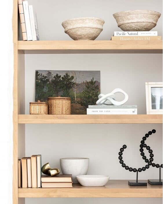
McGee and Co Shelf Picture
Once you have your point of view figured out, you can move onto what you’d want your focal areas to be. For some, this could be a large picture or piece of art, and for others, you may find you don’t have anything specific want to focus on. Regardless of which person you are, you’ll need to figure out what you want to highlight. So let’s use this McGee and Co Shelf picture above as an example. Technically, there are many different focal points of this shelf. But some main ones are the painting, the large bowls on the top, and the black sculptural elements at the bottom. You may be wondering why those items are the focal points, and to explain this I’ll have to loop in the next element you must consider which is grounding the design. As you look at the picture above you will notice that each shelf has its “focal point” or also known as the “grounding piece”. Usually, these are the larger/heavier/or most unique items you’ll be working with.
You wouldn’t want to have the painting, the large bowls, and the black sculptural elements all on the same shelf. This would feel cluttered and heavy. You also wouldn’t want to put these 3 pieces on their own shelves but all on the same side either. This wouldn’t feel balanced and would make that side of the shelf feel weighed down. You instead, want to create a focal point for each individual shelf and also make sure each shelf has a grounding object on it. If you didn’t think about this, one of your shelves may suffer because it would feel like it’s floating or cluttered with a bunch of small items that don’t provide enough contrasting interest. You want your eye to bounce from one shelf to the next as if it was playing hop-scotch. You don’t want it to bounce around like in pinball where there’s no guiding path.
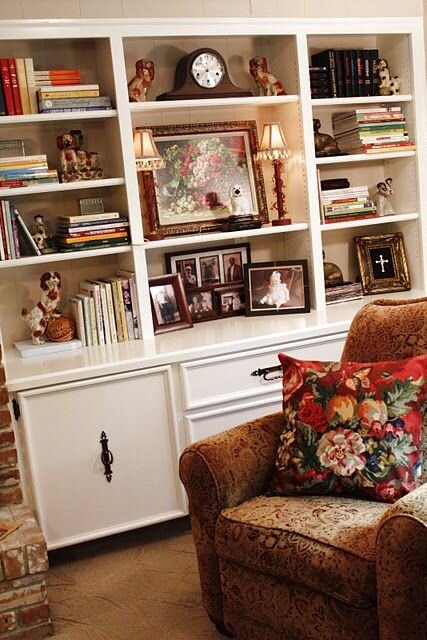
Here’s an example of a bookshelf that doesn’t have enough contrasting decor pieces and feels heavy and cluttered. Each shelf feels like it was thought about individually instead of as an entire bookshelf. So when you step back your eye freaks out a bit and doesn’t know where to rest. Giving your eye a place to pause is crucial when designing a nook or shelving unit. If every shelf is packed tightly with interesting items there’s just too much to consume. These shelves should either have the books in smaller chunks or have them all in 2 lower shelves lined up.
Side Note: Color-coding your books is a nice way to make them visually pleasing and unique. Another idea would be flipping them around so you don’t see the mismatched spines and all you see are the neutral-colored pages. (this isn’t ideal if you’re reading these often and need to identify what they are.)
notesongs.blogspot.com photo I found on Pinterest

The last element to consider when styling shelves would be depth. Ask yourself “Did I create enough depth between objects?” If you never layer any pieces in front or behind one another everything will fall flat and lack visual interest. Instead, consider putting one frame in front of another or a vase in front of that frame. Layering picture frames is a great way to have more than one displayed while also making your shelf feel alive and not stale.
Alongside depth, comes the balance aspect mentioned at the very beginning of this post. I may be bringing up balance last, but it truly is important. The only reason I’m mentioning it so late is because I wanted you to have knowledge on all the aforementioned elements in order to truly understand balance. Balance is like the cherry on top of your ice cream.
Becki Owens Bookshelf Styling Picture from Pinterest
You can’t build an ice cream sundae with the cherry first. You have to finish with it. So in my opinion, take everything I mentioned earlier into consideration and then step back and look at your shelves and figure out what doesn’t feel balanced. If you find there are moments that don’t feel right, consider grouping objects together. The rule of thumb is to group in odd numbers. When you group items in even numbers our eyes feel tension. Whereas, when you group things in 3’s for example, your eye feels calm and moves through the objects easily. Take a look at some pictures in magazines or Pinterest, you’ll notice most people decorate in groupings of odd numbers. If you aren’t going to group in odd numbers, having 2 objects (if they are larger like bowls or vases) looks nice as well. I would also suggest not having too many groupings on one shelf, especially of the same number. You wouldn’t want to have a grouping of 3 small vases on the left side of a shelf and then a grouping right next to it on the right side with 3 small boxes. Instead, you’d want to spread those out and maybe have your grouping of the vases and then on the other side have one large frame with something in front of it.
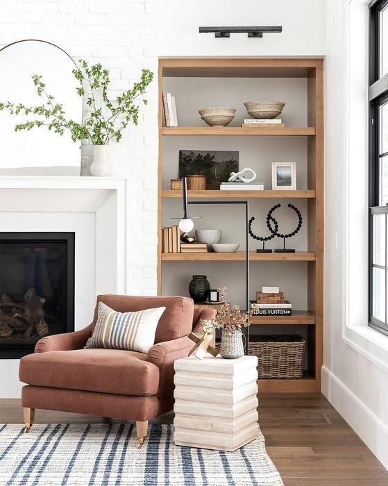
Here is the same bookshelf I showed above, but zoomed out. This is a classic Studio McGee bookshelf with their McGee and Co items on them. Shea is a designer who does an exquisite job of styling shelves. She truly has shelfie goals. So if you’re ever needing inspiration I always seem to turn to her pictures to find some.
If you are wanting more detailed information about styling areas of your house please reach out, you can send me a message through my “What I Offer” page on the website! I’d love to see what items you’re working with and help you figure out how to style your home in an aesthetically pleasing way.
Leave me a comment if this Part 2 was informational for you or if you have any questions about what I shared! I’d love to know if posts like these are helping you make your home more you, or if you’d like me to go into more detail in future posts.